Web
Analytics Made Easy - StatCounter
Jump to content
  • Sign Up

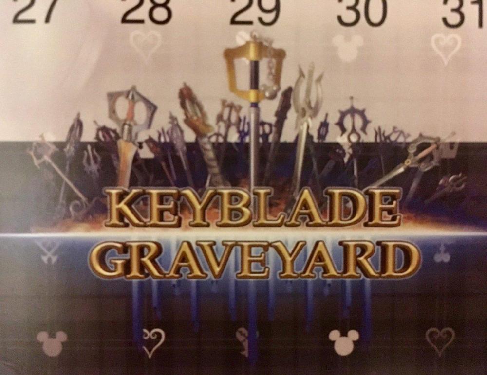
Keyblade Graveyard logo revealed in the 2019 Kingdom Hearts III calendar


NihonScribe

The official logo for the world "Keyblade Graveyard" was revealed in the 2019 Kingdom Hearts III calendar that was distributed at an exclusive press event in Milan, Italy! Check out the image below, courtesy of @MyriamSephiroth

106292492_KH3KeybladeGraveyardLogo.thumb.jpg.29d164cc36408eef29214e9034c3f6f5.jpg

Take a quick look at the press event here:

What do you think of this new logo? Let us know your thoughts down below!

Sign in to follow this  


User Feedback

Recommended Comments

It gave me the chills too in BbS, especially because Sora's Keyblade was there. But it didn't have sense because Sora was out of this story back then. Besides, they tried to use for the "D" of "Graveyard", but they didn't realized that the "D" was wrong. 

Share this comment


Link to comment
Share on other sites

Anyone else notice the 13 pillars at the bottom reminicent of the Organization chairs in TWTNW?

Edited by Azure Flame

Share this comment


Link to comment
Share on other sites

I like the way it is presented but I prefer the BBS logo in terms of font. Of course we will have to wait for the animated version but the font is so generic somehow and doesn't really suit the state of this world with those simple golden letters. Except for its surroundings, it doesn't really look threatening at all, whereas the other world names blend in with the theme of their world quite nicely.

It's not that important but I just enjoyed how it was set up in BBS with the Kingdom Key and the harsher letters, despite the rest looking very good in this one too.

Share this comment


Link to comment
Share on other sites

My thoughts on this is that sora will not use his kingdom key anymore he will leave it in keyblade graveyard and in the next saga he's base keyblade will be master's defender ;)  Do not forget sora will always be the protagonist it is confirmed by Nomura  :D 

Edited by Mariokhfanboy18

Share this comment


Link to comment
Share on other sites

Ok... I'm gonna be sincere... I pretty much didn't like this logo... I think it's because of the typography used in this logo. While the overall look it's great... I think the BBS one was MUCH BETTER looking. Other than that it's ok, but I like other logos better.

Share this comment


Link to comment
Share on other sites

Thank you for showing this to us, NihonScribe!

Holy heck, I love the logo for the Keyblade Graveyard this time around! It's simple and at the same time it bears an ominous feeling to it. Especially with Sora's Kingdom Key standing front and center among all the other Keyblades. 

That kinda scares me...

Share this comment


Link to comment
Share on other sites


Join the conversation

You can post now and register later. If you have an account, sign in now to post with your account.

Guest
Add a comment...

×   Pasted as rich text.   Paste as plain text instead

  Only 75 emoji are allowed.

×   Your link has been automatically embedded.   Display as a link instead

×   Your previous content has been restored.   Clear editor

×   You cannot paste images directly. Upload or insert images from URL.

Loading...

×
×
  • Create New...