Web
Analytics Made Easy - StatCounter
Jump to content
  • Sign Up

The Japanese box art for Kingdom Hearts HD 1.5 + 2.5 ReMIX has been updated


The 13th Kenpachi

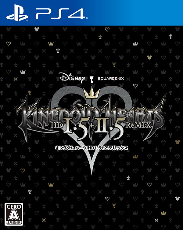
The Twitter account for the Japanese Square Enix store has stated that the Japanese box art for Kingdom Hearts HD 1.5 + 2.5 ReMIX has been updated. You can view the box art below:


Kingdom Hearts HD 1.5 + 2.5 ReMIX Japanese box art

Sign in to follow this  


User Feedback

Recommended Comments

I like this more, to be honest. At least it isn't "Main characters with their weapons" -cliché and it doesn't seem like a bad fan-made image where the covers of the two included games were just slapped side by side.

Share this comment


Link to comment
Share on other sites

I'm not surprised at all... Japan has a thing when it comes to cover arts with just the logo on it.


I like this more, to be honest. At least it isn't "Main characters with their weapons" -cliché and it doesn't seem like a bad fan-made image where the covers of the two included games were just slapped side by side.

I don't like the logo being used as the box arts, I'll explain why.


This is the definitive version of the first 6 games of the Xehanort saga, a lot of people need to catch up to the series in preparation for KH3. Now imagine someone in a store, they don't keep up with KH news and have never played any game in the franchise, they see the box art with a logo on it-does it catch their eye? No, probably not. The NA and EU box art looks a lot more appealing and eye capturing because actual character art is being used rather than just a logo. 

Share this comment


Link to comment
Share on other sites

I don't like the logo being used as the box arts, I'll explain why.


This is the definitive version of the first 6 games of the Xehanort saga, a lot of people need to catch up to the series in preparation for KH3. Now imagine someone in a store, they don't keep up with KH news and have never played any game in the franchise, they see the box art with a logo on it-does it catch their eye? No, probably not. The NA and EU box art looks a lot more appealing and eye capturing because actual character art is being used rather than just a logo. 


Oh yeah, now that I look it with that perspective, I can agree. I personally enjoy those unique box arts more, but I do see the problem if, for instance, I try to get my friends to buy this game. It would be pretty confusing.

Share this comment


Link to comment
Share on other sites

It just looks the same as the placeholder box art but with a more solid background. The logo also looks more polished. Other than that, it's extremely bland compared to what we are getting here in the West.

Share this comment


Link to comment
Share on other sites

I'd rather have this boxart than the NA boxart. I don't really like the side by side arts of 1.5 and 2.5 style.


But like The 13th Kenpachi said, these remixes are also for those who wants to catch up the serie before Kingdom Hearts 3 release or newcomers. Boxart are made to be attractive. And, yeah, pretty sure that someone who doesn't know Kingdom Hearts seeing this box won't be interested by the game just by looking the front.


I own merely all Kingdom Hearts game, remixes included, that's why I'd rather have a simple and sober boxart than a patchwork of two boxart that I already have.


So... The best thing to do is a flippable boxart. The one by default being the two remixes arts and the other being the logo alone.

Share this comment


Link to comment
Share on other sites

I like this more, to be honest. At least it isn't "Main characters with their weapons" -cliché and it doesn't seem like a bad fan-made image where the covers of the two included games were just slapped side by side.

Speak for yourself. Pretty boring as far as KH box covers go if you ask me. It's fine for the box around the disc case, sure, but the case's cover itself? Just should have stuck with that composite image of 1.5 and 2.5's covers together, at least it was more straightforward with what it was. This feels more like a placeholder than an actual release cover.

Share this comment


Link to comment
Share on other sites

So is no one wondering whatever happened to that Kingdom Hearts Limited Edition PS4 Slim that was suppose to release when KH 2.8 came out in Japan???? There is still no pictures or videos of it online.

Share this comment


Link to comment
Share on other sites

I don't like the logo being used as the box arts, I'll explain why.


This is the definitive version of the first 6 games of the Xehanort saga, a lot of people need to catch up to the series in preparation for KH3. Now imagine someone in a store, they don't keep up with KH news and have never played any game in the franchise, they see the box art with a logo on it-does it catch their eye? No, probably not. The NA and EU box art looks a lot more appealing and eye capturing because actual character art is being used rather than just a logo. 


It just looks the same as the placeholder box art but with a more solid background. The logo also looks more polished. Other than that, it's extremely bland compared to what we are getting here in the West.

We will get the same boxart for the limited edition.

The official case could be now even the same.


Anyway I like this one better. It would have been better if they add two Sora's at the left and the right side.

Share this comment


Link to comment
Share on other sites

With this box art reveal, I have a strong feeling the primary target of this game compilation in Japan isnt newcomers but existing KH fans who either have been on board since Day 1 or dropped somewhere in the series through the console switches. Even the bonus of a box to hold both PS4 games is a sign that they are rewarding those who are already on board.


The NA and EU box arts are catered more towards an audience perhaps that has no idea about the series.


Imo, i like the JP art better cuz its just classier. Slapping both existing artworks on the cover is a bit of a tacky / desperate attempt to catch people's attention and, in a way, paints a picture of the game being "recycled" material, or a "greatest hits" version.

Share this comment


Link to comment
Share on other sites

I find this really weird.  But if you get the limited edition of the game from the store don't worry you will get that cover as well but it will have the game box with the logo on it just like the it was with the 2.8 Limited Edition box it was a box with just the logo on the front and then you open it and you get the game box with the actual cover, they just had that box so it could hold the pin.  God I really hope they don't do this for Kingdom Hearts 3 have the limited edition box also be the cover art for the plain box and not just generic background with the logo that would be so lame 

Share this comment


Link to comment
Share on other sites

like this more than the other one to be honest it goes nicely with the kingdom hearts soundtrack box


Like this wayy more!


That's cute, but Square Enix are basically shooting themselves in the foot by placing pride over marketing in their domestic region.

Share this comment


Link to comment
Share on other sites

Thank you for showing this to us, Master Kenpachi!


Well, this cover looks neat and pretty! I really don't mind this one or the other one we were shown! Just the fact that it's the ReMixes available for the PS4 is enough for me! X3

Share this comment


Link to comment
Share on other sites

I like it, it's clean and sleek. I don't want a spectacle for a cover, and it looks very typical of a cover just mashing characters together, and with the two covers combined looks tacky. I can see it being better for marketing purposes though.

Share this comment


Link to comment
Share on other sites

Rob likes. Nomura isn't making any new artwork for it so they have nothing to show.


That's cute, but Square Enix are basically shooting themselves in the foot by placing pride over marketing in their domestic region.


Shooting themselves in the foot? lol You must be a native of Japan to know what is best and what is not best for them.

Share this comment


Link to comment
Share on other sites

Rob likes. Nomura isn't making any new artwork for it so they have nothing to show.


Shooting themselves in the foot? lol You must be a native of Japan to know what is best and what is not best for them.

In Japan everyone knows about KH, the box art doesn't matter over there.In the west it is very different.

Share this comment


Link to comment
Share on other sites


Join the conversation

You can post now and register later. If you have an account, sign in now to post with your account.

Guest
Add a comment...

×   Pasted as rich text.   Paste as plain text instead

  Only 75 emoji are allowed.

×   Your link has been automatically embedded.   Display as a link instead

×   Your previous content has been restored.   Clear editor

×   You cannot paste images directly. Upload or insert images from URL.

Loading...

×
×
  • Create New...