Web
Analytics Made Easy - StatCounter
Jump to content
  • Sign Up

Lighting improvements shown in recent Kingdom Hearts HD 2.8 Final Chapter Prologue TGS 2016 demo


Jake

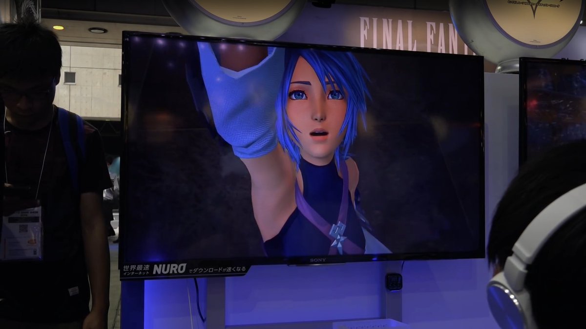
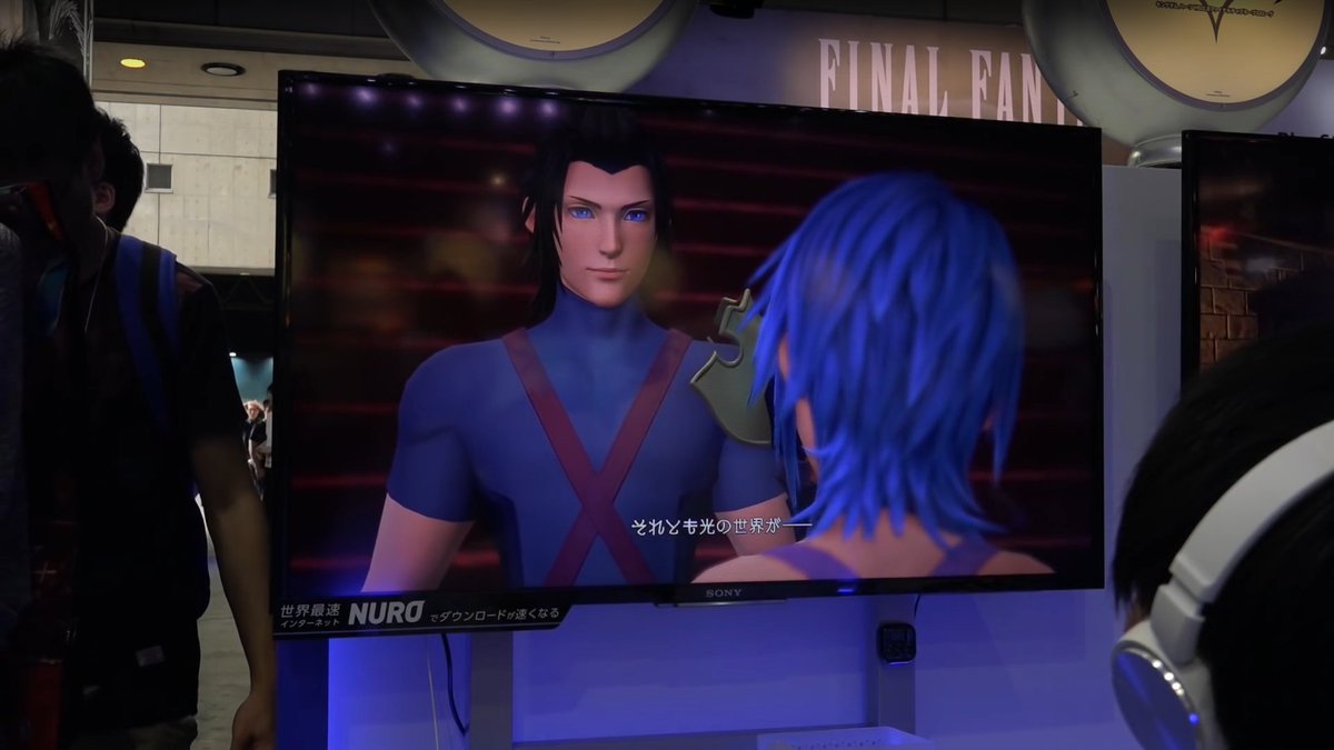
With Tokyo Game Show 2016 running from September 15th till the 18th, Kingdom Hearts HD 2.8 Final Chapter Prologue was available for attendees to play as they await for the release on January 12th, 2017 in Japan and January 24th, 2017 everywhere else.


In the playable demo, it appears as though the lighting has gone through a major change. This change seems to have been an improvement from the E3 2016 demo that was available for attendees. You can check out some of the comparisons below, thanks to YouTube user Gamersyde Official for the TGS 2016 demo capture and GameXplain for the E3 2016 capture.


E3 2016

<3 <3 <3


1ca4e6e5a8d04809a6cb0c9635c2a49c.png


13446a69632644ab9e8d285ebfe22790.png

TGS 2016

<3 <3 <3


CsqLyljVMAA6l_A.jpg


CsqL1cGUAAA9Bub.jpg


You can check out the full videos below for each demo thanks to those respective users as well.


Did you notice any other differences? Let us know in the comments below!

Sign in to follow this  


User Feedback

Recommended Comments

You know, it's moments like these where we have to be thankful for the works that lighting departments do for video games and animated movies.


And another thing...


BE CAREFUL WHO YOU CALL UGLY IN MIDDLE SCHOOL :P

Share this comment


Link to comment
Share on other sites

It honestly looks the same to me. I just don't see the difference.

Are you kiddin'? The skin in Terra´s face as his look have been improved by a lot! The face it´s still emotionless but that´s part of the scene but you can see the change on the way he seems realistic compared to the last demo where he looked totally plastic and plain. But that´s just my opinion tho.

Share this comment


Link to comment
Share on other sites

It honestly looks the same to me. I just don't see the difference.


And so it begins... on a more serious note, look at the eye and nose placement from E3 Terra to TGS Terra. That alone can help you identify the differences.

Share this comment


Link to comment
Share on other sites

Are you kiddin'? The skin in Terra´s face as his look have been improved by a lot! The face it´s still emotionless but that´s part of the scene but you can see the change on the way he seems realistic compared to the last demo where he looked totally plastic and plain. But that´s just my opinion tho.

And so it begins... on a more serious note, look at the eye and nose placement from E3 Terra to TGS Terra. That alone can help you identify the differences.

I tried to see it, but I just don't see it. I guess I'm not the person who judges games by graphics much

Edited by Zeldablade7

Share this comment


Link to comment
Share on other sites

I tried to see it, but I just don't see it. I guess I'm not the person who judges games by graphics much

We're not necessarily judging by graphics, just that some have a good eye for these things

Share this comment


Link to comment
Share on other sites

I tried to see it, but I just don't see it. I guess I'm not the person who judges games by graphics much

Neither am I, yet even I can see a clear improvement. 

Share this comment


Link to comment
Share on other sites
I tried to see it, but I just don't see it. I guess I'm not the person who judges games by graphics much

It's not even the graphics that much it's more of the lighting and saturated colors are fixed just look at Aqua in the first picture she's almost white as a ghost lol.


Share this comment


Link to comment
Share on other sites

It's not even the graphics that much it's more of the lighting and saturated colors are fixed just look at Aqua in the first picture she's almost white as a ghost lol.

okay, I think I see it now. 

Share this comment


Link to comment
Share on other sites

It looks sooo much better now. Many people complained about Terra looking weird, which was true. I also like how they updated Riku's model to make his arm muscles more visible huehue. Slight changes where already visible at gamescom but this comparison is almost drastic.

Share this comment


Link to comment
Share on other sites


Join the conversation

You can post now and register later. If you have an account, sign in now to post with your account.

Guest
Add a comment...

×   Pasted as rich text.   Paste as plain text instead

  Only 75 emoji are allowed.

×   Your link has been automatically embedded.   Display as a link instead

×   Your previous content has been restored.   Clear editor

×   You cannot paste images directly. Upload or insert images from URL.

Loading...

×
×
  • Create New...